Project Context
Contemporary TV-design for BMX and freeride bicycles
United Merida Freerider is a Korean brand that specializes in special bikes, more in the lower price segment. Target group: young people.
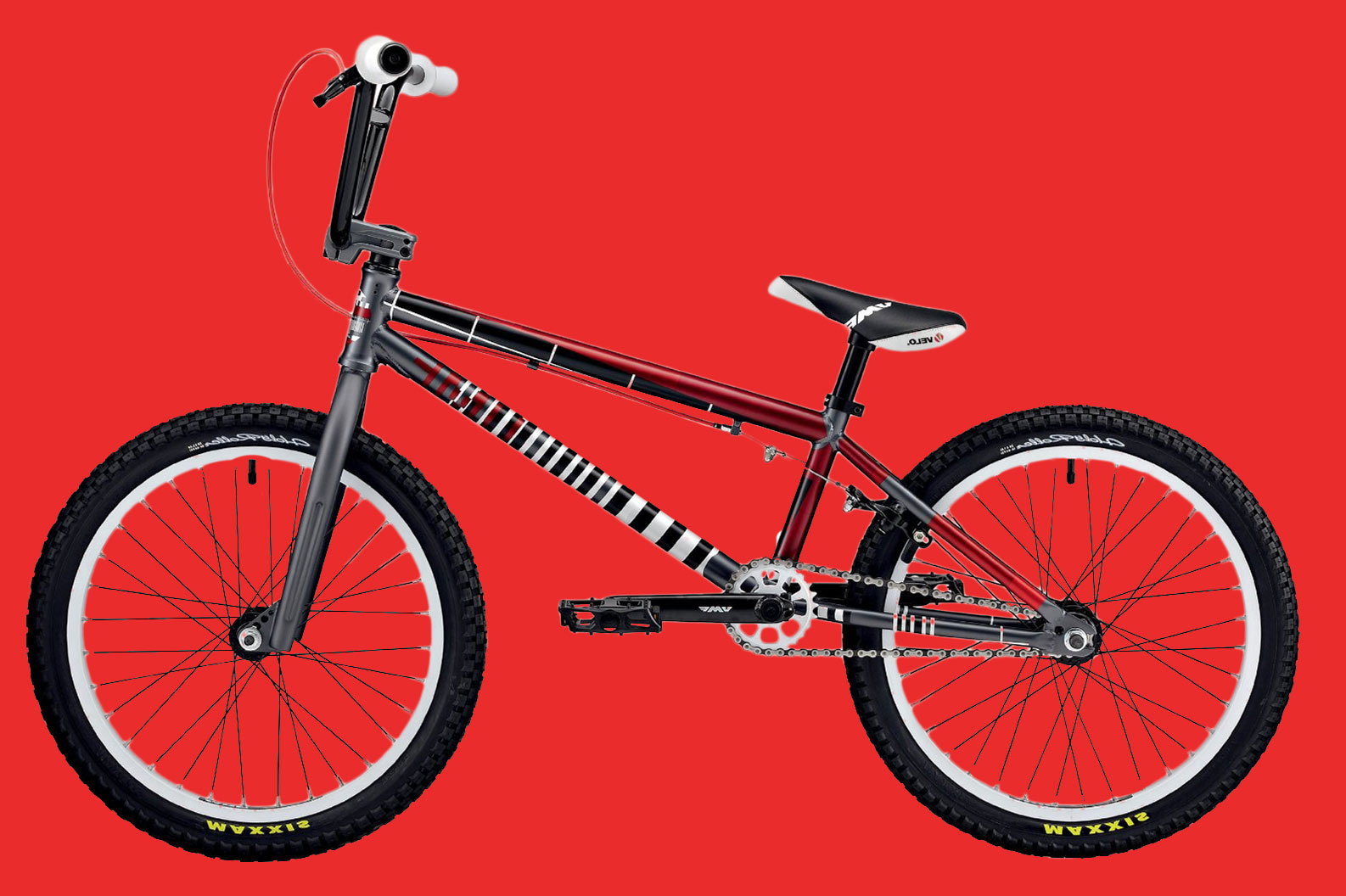
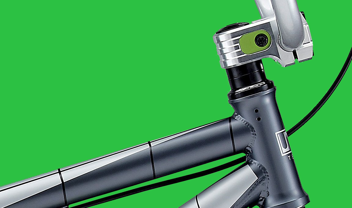
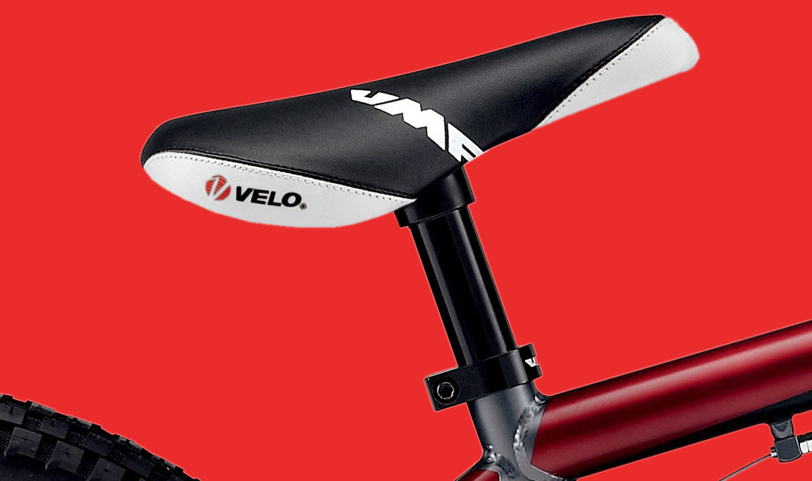
The task was not to design the bike itself, but its surface, because the design was laid over the frames like the skin of a snake. At the Stuttgart agency Dorten, allowed me to further develop the existing TV design.
Kickstarter Question: How can you inspire young people? Does the medium bicycle with its poles and struts allow new possibilities for design?
Bicycle-Skin Design


Design Concept
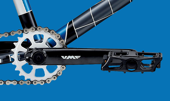
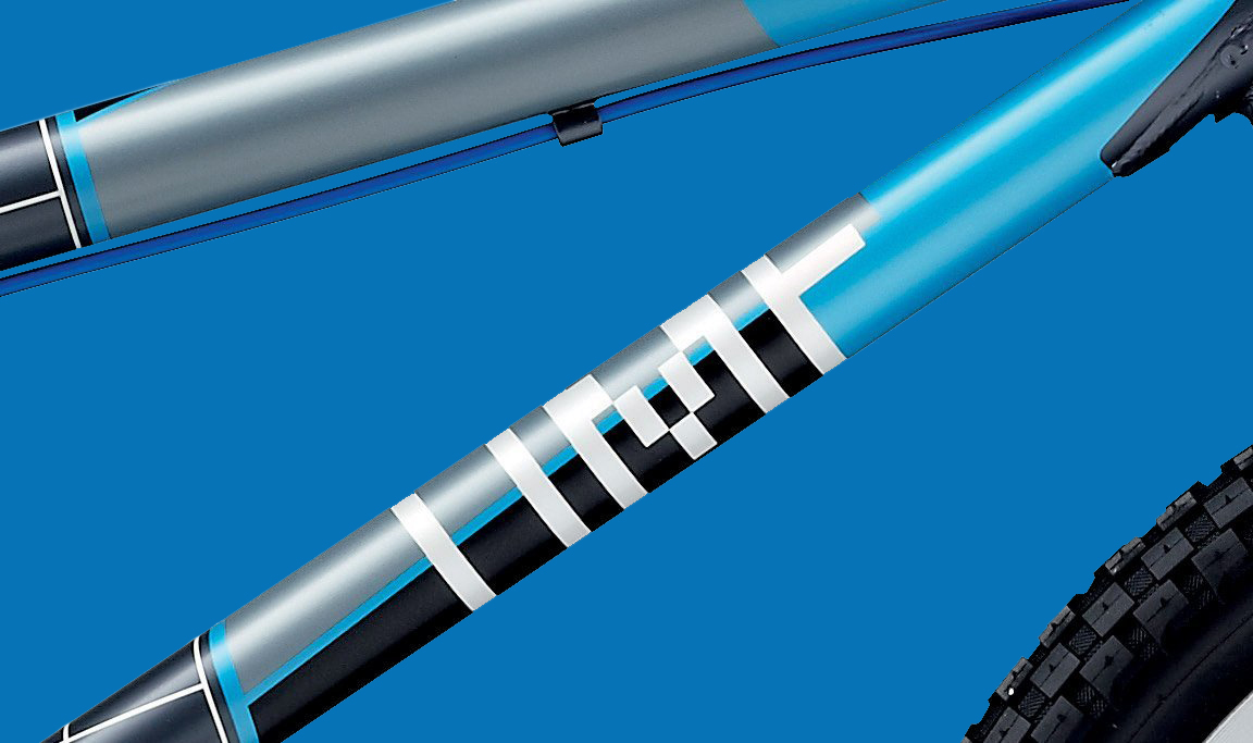
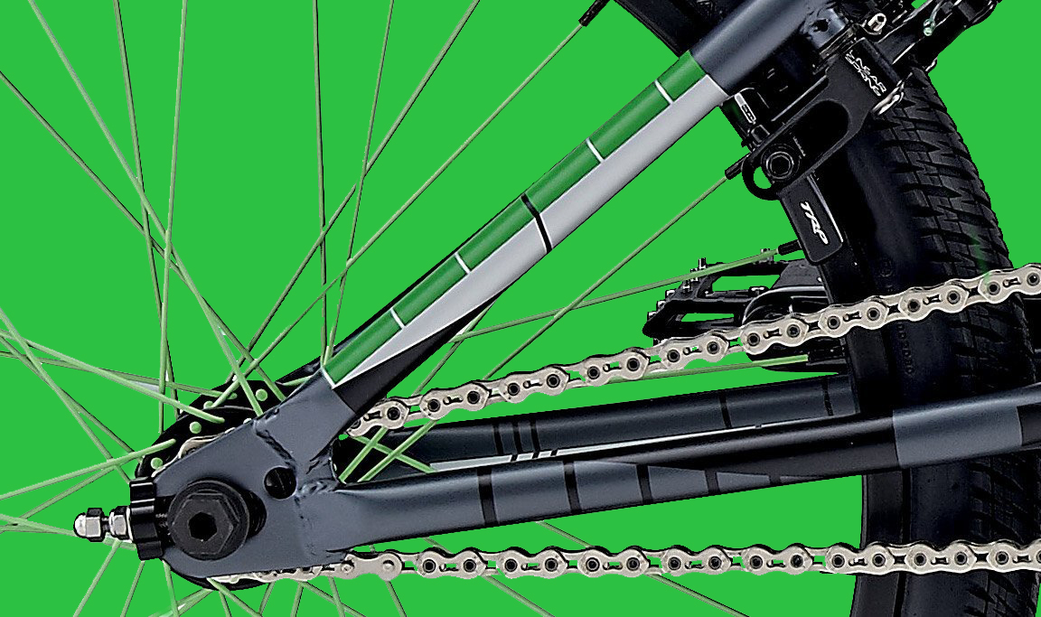
We have consistently applied the TV test pattern to the collection. The three quality levels of the bikes were categorized in the monitor-typical colours red, green and blue. The areas, lines and grids typical for the test pattern were placed over the frame. It was important to me to take the medium seriously and to continue the lines when they hit the next strut or other parts like the brake cable.
The result was a design that was loved by the kids, even if it referred to a past medium. The power of the ride was literally transmitted through the frame to the whole bike.


Credits
Client
United Merida Freerider
Client
United Merida Freerider
Agency
Dorten GmbH
Creative Director
Guido Negenborn
Bjørn Küenzlen
Design
Frank Martin Dietrich
Related Projects
contact{ät}efemde.de
© efemde 2020 Terms of Service & Privacy Policy
© efemde 2020
Terms of Service & Privacy Policy
© efemde 2020
Terms of Service & Privacy Policy

