Project Context
Redesign of the Bauhaus gallery
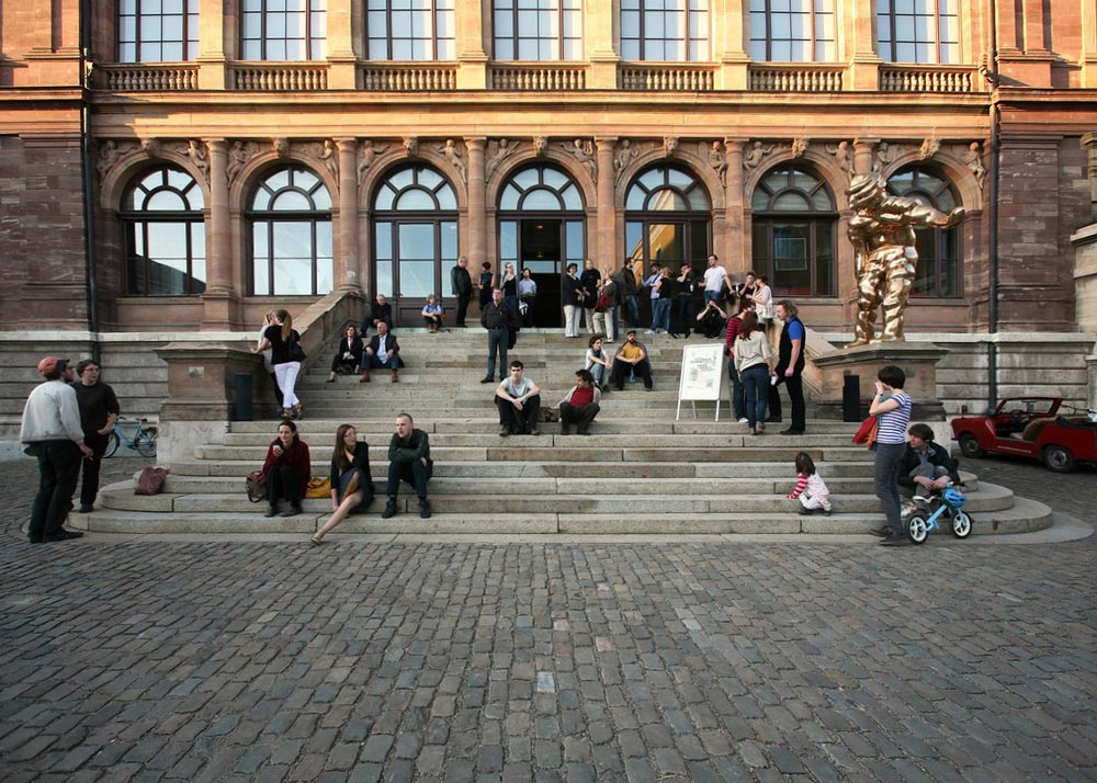
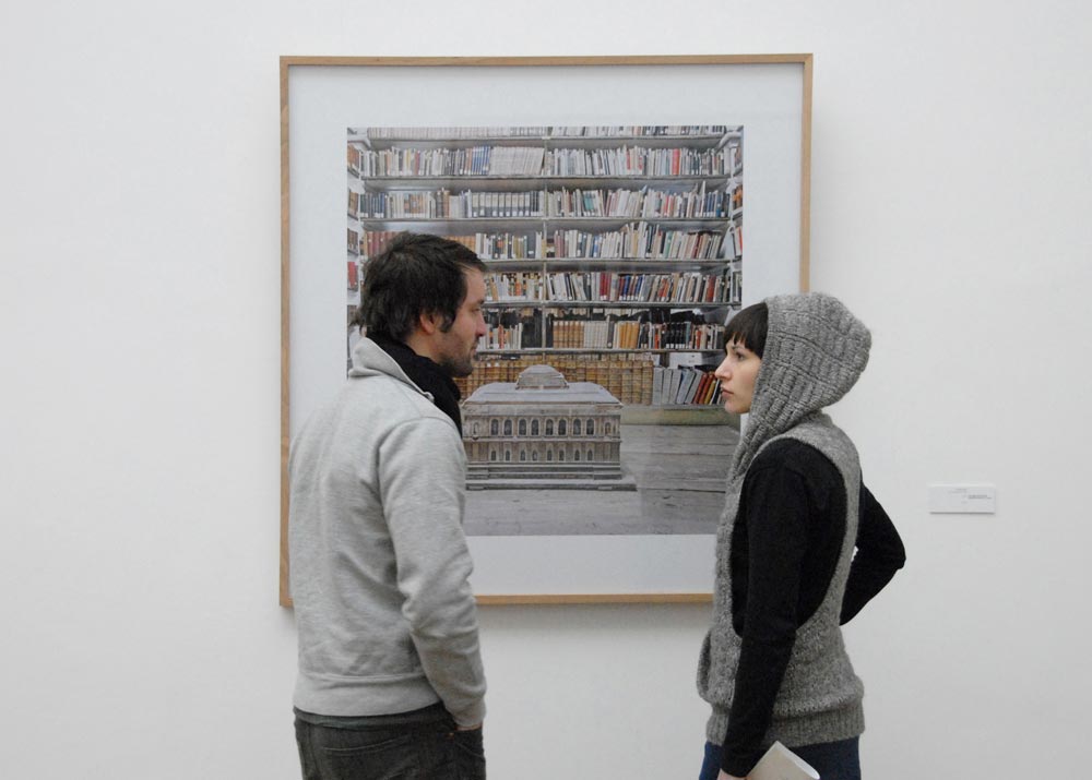
Since March 2008 the gallery marke.6 has provided a stage for the public presentation and discussion of the creative work of the Bauhaus University Weimar. This platform is particularly important for artists, as they need an audience beyond the small town and university in order to develop successfully. Each exhibition of the brand is conceived and executed with other participants. Gallery marke.6, provides the space for a boundless development of all disciplines. This makes each exhibition unique.
In 2012, I was called upon to update the whole design and make it more visible. How do you create a fixed framework for such an unstable place that will provide the needed attention, but also give the necessary space for free development?
Kickstarter Question: What does a gallery look like, which actually cannot commit itself to an external appearance?
Brand Design
Strategy
Catalogue Design







Design Concept
The space is there for the artists. The communication space is for the designer. Marke.6 wants to give young, creative graphic designers the chance to explore their potential, find new ways of expression and present their style.
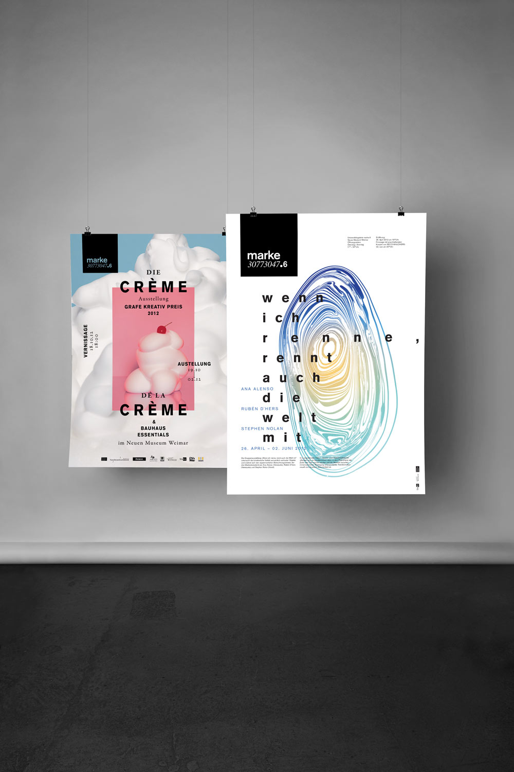
The place merely designates the room. The form and statements of the content are defined anew at each exhibition. The communication space is to be handled in the same way. The respective graphic designer is allowed freedom themselves and thus has the opportunity to contribute their own individual design.

Ruled Freedom
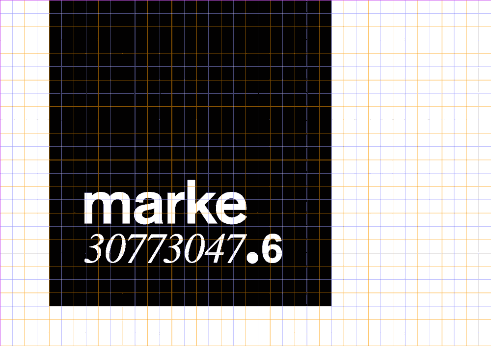
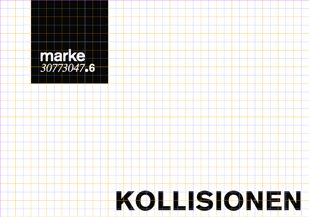
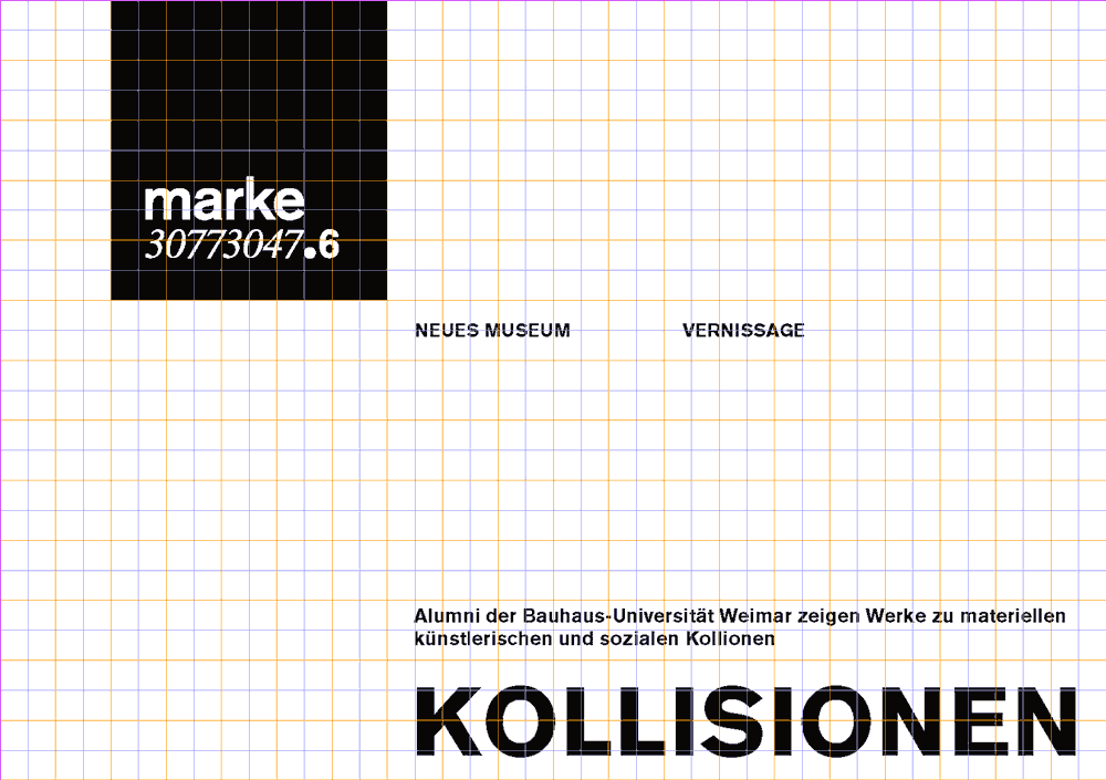
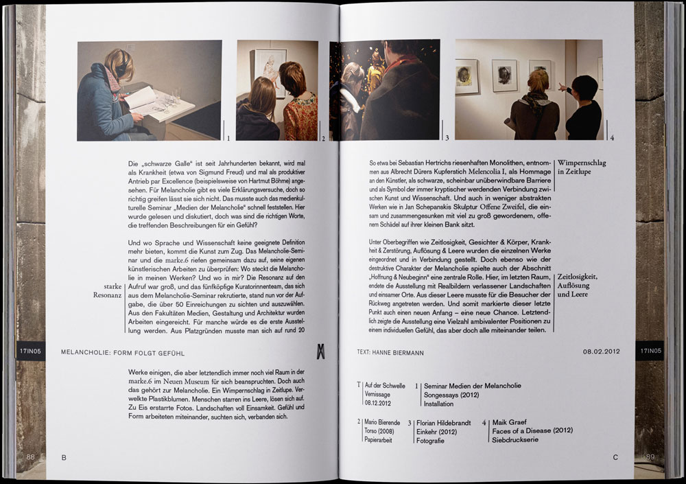
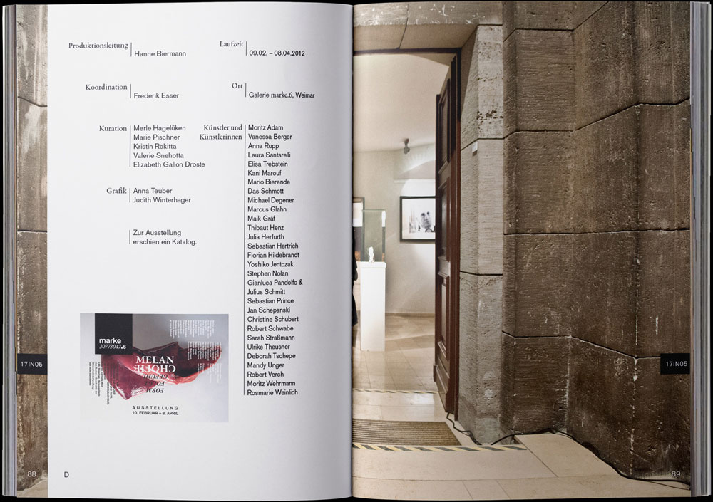
Label, grid and font are the core elements for brand recognition. All other decisions are made by the exhibition designer.


Anniversary Catalog
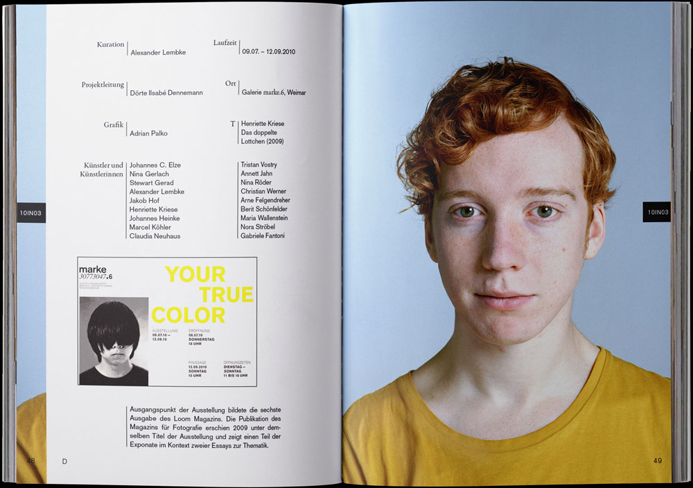
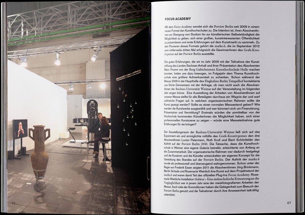
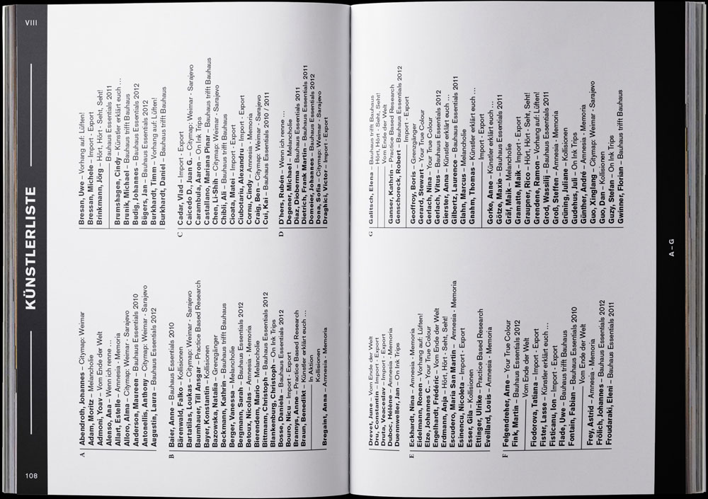
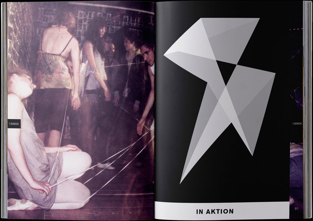
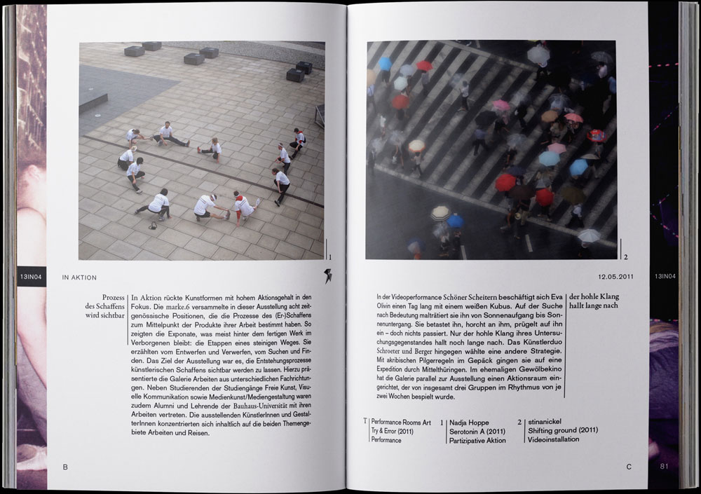
In the five years of its existence, the marke.6 has already realized 21 exhibitions.








Credits
Clients
Klassikstiftung
Bauhaus Universität
StuKo Weimar
Concept & Design
Frank Martin Dietrich
Exhibition Designer
Bauhaus Essentials: Manuel Birnbacher & Jan Ziegner
Kollisionen: Elisa Trebstein & Marc Bredemeier
Wenn ich Renne…: Anna Teuber & Ina Niehoff
Related Projects
contact{ät}efemde.de
© efemde 2020 Terms of Service & Privacy Policy
© efemde 2020
Terms of Service & Privacy Policy
© efemde 2020
Terms of Service & Privacy Policy
